Their wedding story:
Margot and Phillipe are one of the coolest couples I have worked with so far. When I heard that they were set to marry in an ancient chapel on a cliff in Spain, overlooking a sea and a 15th centaury watch tower, I almost asked them to include me in their guest list! They chose the stunning El Far Hotel in the Costa Brava. Built over a former 18th century inn and overlooking the sea from the top of a 175 m high cliff, the El Far Hotel Restaurant has the ancient chapel, Sant Sebastià de la Guarda in close proximity to its courtyard. I couldn’t think of anything more perfect. The ceremony was very intimate and then their guests could enjoy the view from the terrace while the appetisers were served before the main meal. They ended the night with fun music and dancing.


Their Pret a Papier story:
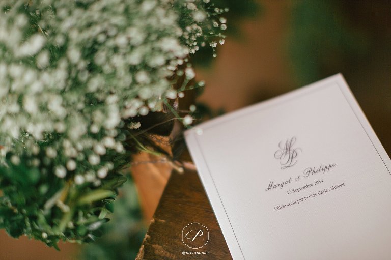
When I first met Margot, there was a very chic understated air about her. Straight from her yoga class dress in a casual summer dress and her very boho bag. She and Phillipe both worked for luxury retail giants, and there was no doubt that their wedding stationery would be anything less than fashionably chic.
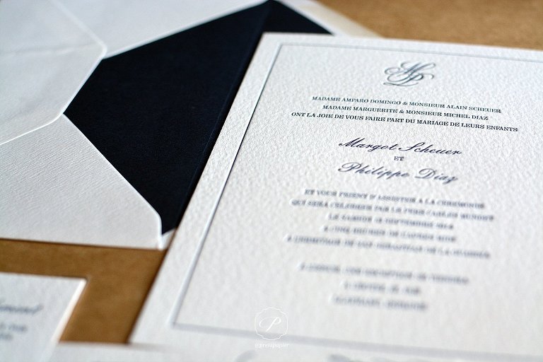
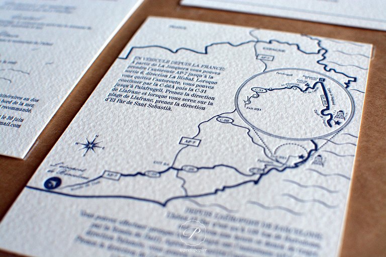
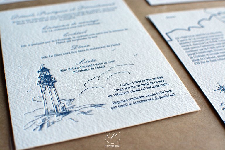
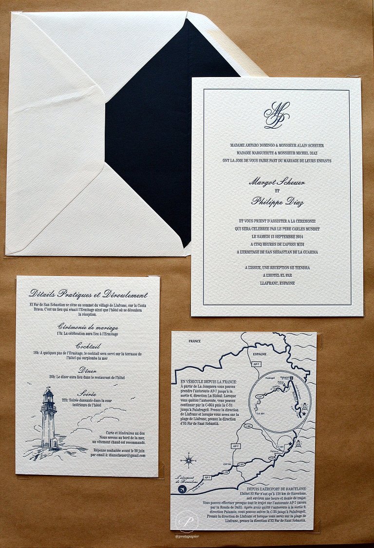
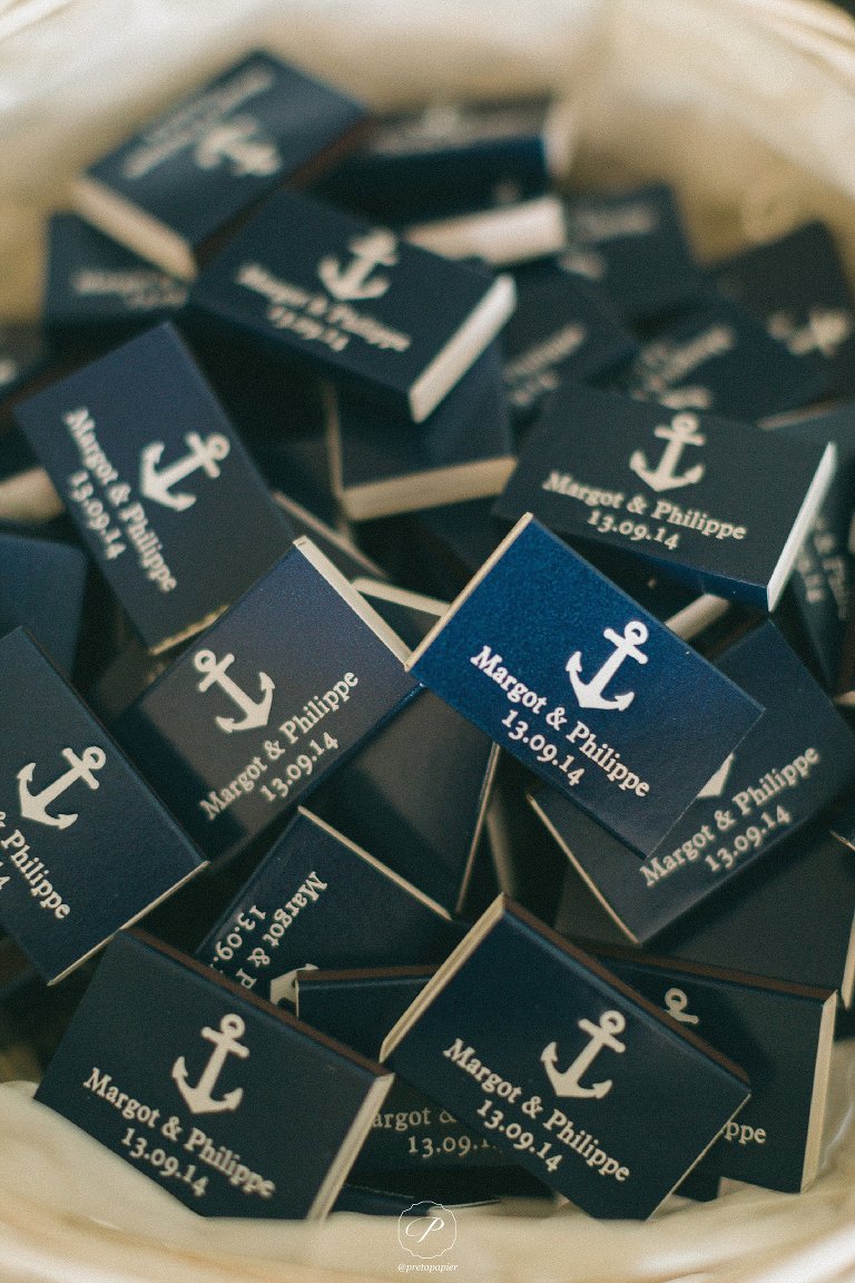
They wanted a very nautical style invitation suite, with simple navy and white. We worked through several nautical elements, like knots, ropes, anchors and lighthouses. And came up with a combination of all these elements woven seamlessly into the design of an information card and a custom direct map for the guests that would be travelling from France and Spain. But the invitation remained fairly simple with a combination of the beautiful script text, a serif condensed font and clean lines.
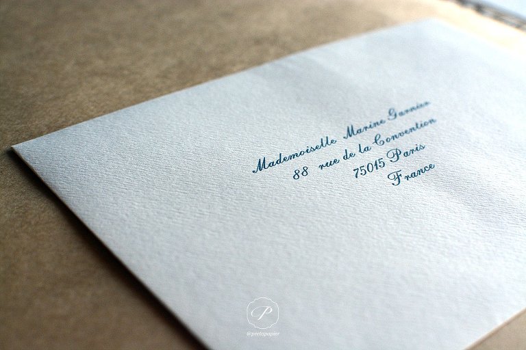
Of course we had to choose letterpress to make this invite as elegant as the couple’s tastes. They selected a dark navy liner for the envelopes and custom printed each recipient’s address on the front. Timeless!
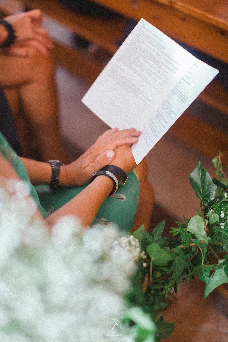
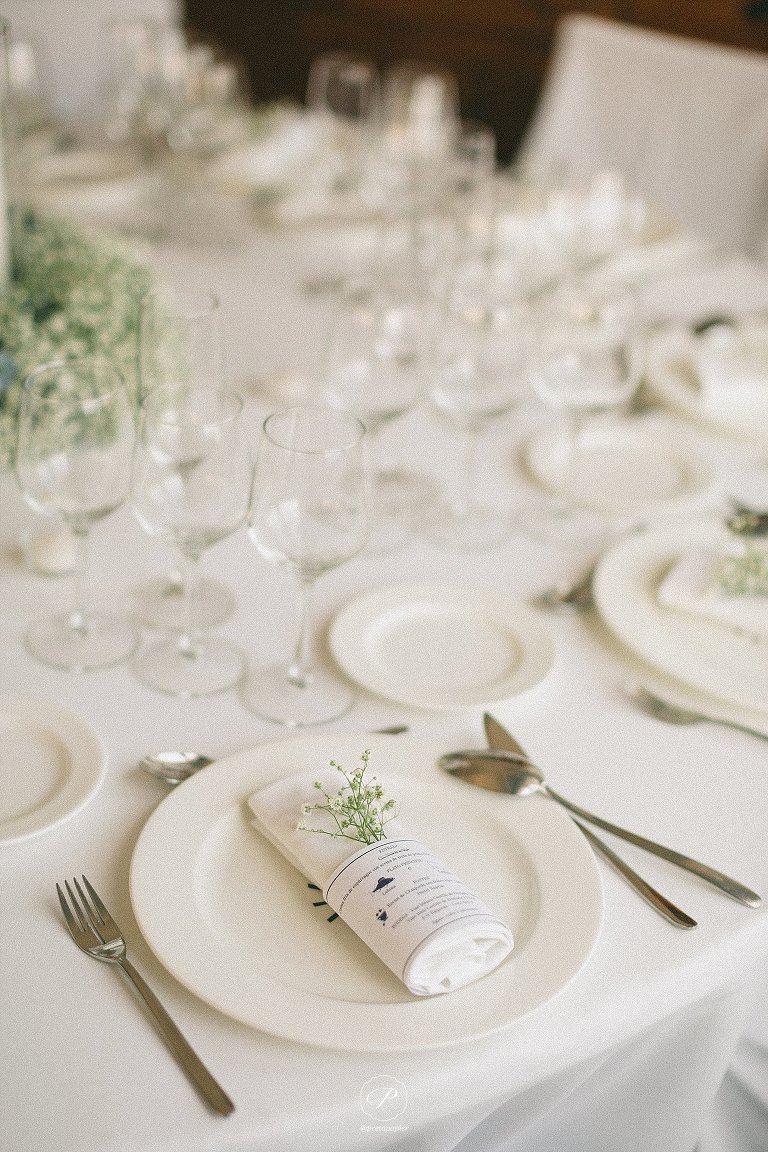
The wedding on the day stationery had the nautical monochrome theme followed throughout which unified and simplified the dual language pieces. The ceremony booklets or Order of Service booklets were placed on pews decorated with simple Baby’s Breath posies. The little chapel came alive with these elegantly beautiful flowers and were the only decoration needed along with cathedral candles.
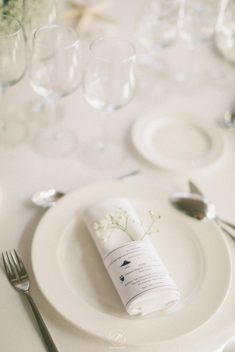
Margot was definite she didn’t want an elaborate “haute-cuisine” menu, so we kept it simple with a belly band that pictorially described what the guests would dine on, wrapped around their napkins. That’s a great way of de-cluttering your place setting.
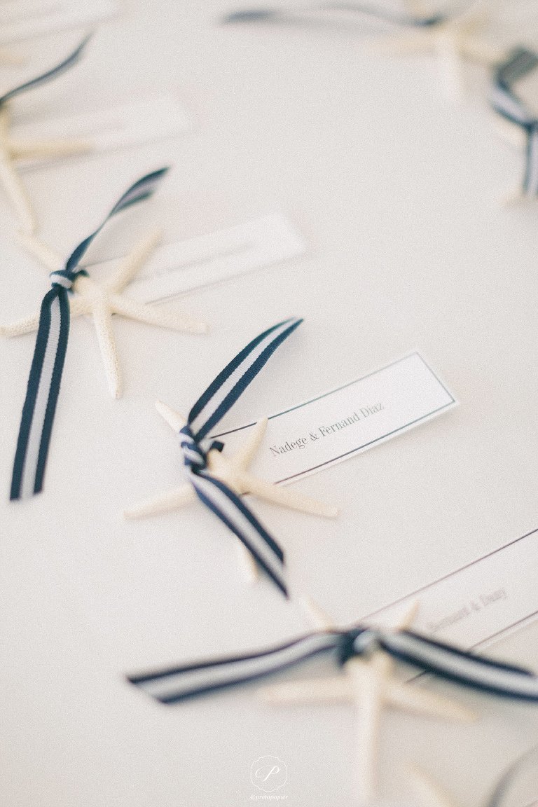
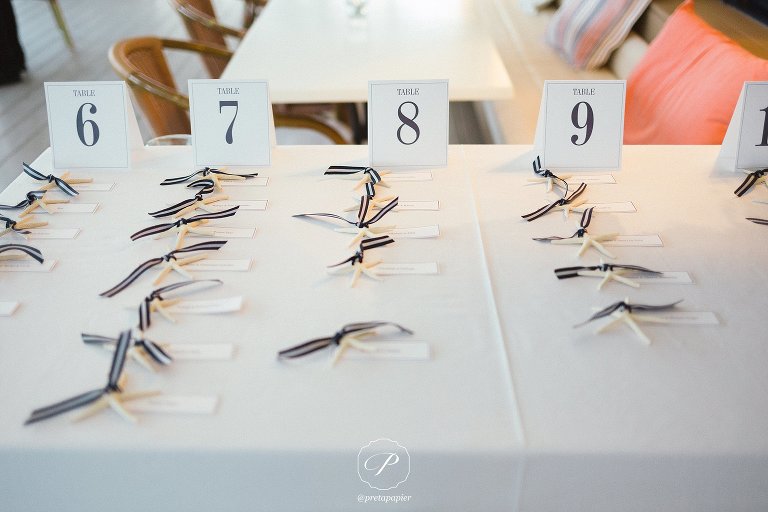
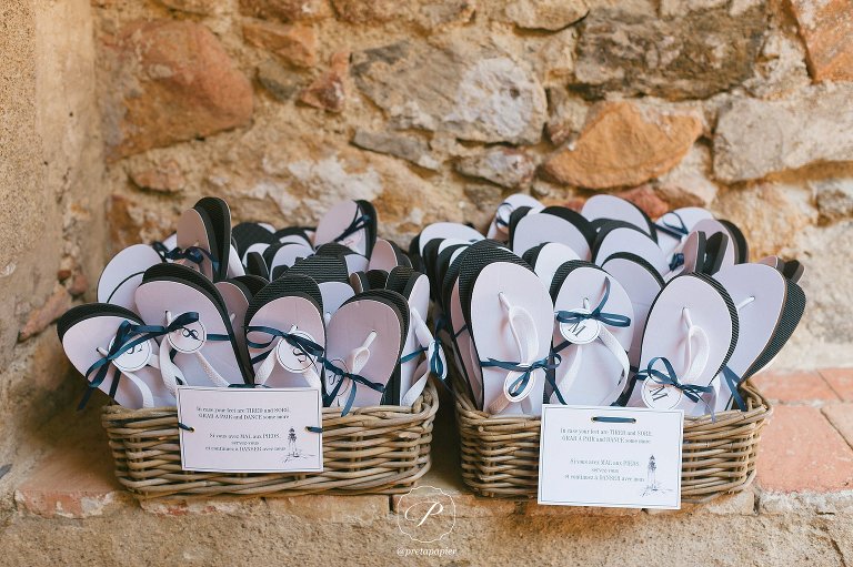
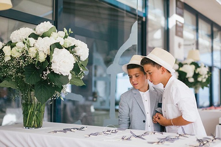
My favourite part of the place setting stationery was the personalised escort card attached to a natural starfish tied with this amazing nautical inspired ribbon! Functional, beautiful and clever, because the couple had guests from all over the world and would not receive RSVPs soon enough for a traditional seating plan to work. We came up with this genius idea that worked perfectly and was a great conversational piece. As the night progressed the bride had the chance to literally “let her hair down” and dance the night away with her new husband and guests. I’m sure the personalised flip flops came in handy.
Featured on: Belle and Chic- Stylish Mediterranean Weddings. Photography: En Route photography Videography: One Day One Song Dress: Jenny Packham


